Artwork Requirements
The following tips will save time & effort when designing your signs.
To save you time and cost we have adopted the PDF file format.
What is PDF?
PDF stands for Portable Document Format. It was created by Adobe and it has become the standard for most document transfers. PDFs provide smaller file sizes, eliminates font issues, can be opened and used by most graphic software, includes all formatting features and includes all images.
PDFs can be created in numerous ways. Most graphics applications allow you to save directly as PDFs. If your application does not, there are third party plug-ins applications that will allow you to convert files.
Here is how to prepare your file in most graphic software:
Art board dimensions
Choose the art board dimensions to match the dimensions of your sign. Art board size = sign size
Position your design on the art board
Position your layout in the middle of the art board and make sure you leave a 1/4” white border around your artwork unless you are designing a bleeded sign.
Remember that PDF format only saves the content inside the art-board, anything outside will be cropped.
If you are working with a picture you should use a photo editing program to crop large images as opposed to masking them. This will significantly reduce file size which results in faster upload and printing time.
Work at full scale
Work in full size when possible, however if the file size is too large you can set up files at 1/2 or 50%, 1/4 or 25%, scale and adjust dpi accordingly. Please make sure you indicate this on the order form.
For example, if you are designing at 50%, then for close up work you must begin with or down-sample to no less than 360dpi. Enlarged, this will give us 180dpi which works very well.
When working at scale please remember to use higher resolution images. For example, if you are designing at 50%, for close up work you must begin with or down-sample to no less than 360dpi (twice as much as needed). Enlarged, this will become 180dpi which works just fine.
Resolution of the images
Bitmap, jpg, tiff and other rasterized images have a fixed resolution. This means that the larger they are printed, the lower the quality of the final output. Make sure you check the resolution of your images and be aware of the following guidelines:
For the purposes of most signage, images should have a resolution of 180dpi at final print size. This provides a good image close up. The farther your sign will be viewed at, the smallest the resolution needed. The lowest acceptable image size for yard signs is 110dpi.
Some programs, like Photoshop can resample images by interpolation, but in reality increasing the resolution will not solve this problem if there are not enough pixels to begin with. The program will add more pixels based upon estimation of their location and will then assign their neighboring pixels colour value. This may cause an image to look muddy. Your best choice is to use good size image to begin with.
Embed the fonts
When saving your file as a PDF, choose the option to embed the fonts. This provides our RIP software with the necessary information to print your job, otherwise your fonts will be replaced and will not look like the ones you chose.
Another option is to convert all text to outlines. If this is not possible, include all fonts when uploading your files. TrueType fonts are preferred. Please let us know on your order form.
Embed the images
Before you save your PDF make sure that all your images are embedded and not linked.
Work in CMYK
While CMYK printing does have some limitations, we have a very good colour gamut. Some RGB images may print better as RGB, but unexpected results may occur. Working in the CMYK colour mode provides the most consistent colours.
Use Pantone colours for most spot colours
Our RIP software will match spot colours if you use the standard Pantone Colour scheme from your application. These standard colours provide the best possible colour match. Avoid using spot colours in gradients or having transparencies interact with spot colour filled vector images. In these cases please use CMYK colours.
Choose high quality compression
Choose to compress line art and text
Proof your artwork
In Adobe Reader: After saving your file as PDF, open the file in Adobe Acrobat Reader (available free from Adobe). If you have designed at full size, then set your zoom to 100% (at 200 for 50%, and so on.)
Scroll around and proof for resolution and fine detail.
Pan around and ensure the resolution is adequate for the viewing distance. You may step away from your computer to judge if the pixalation is acceptable.
Make sure all elements are present and appear as you expect them to.
Reduce your view to check larger items, and "view fit to page" to ensure that all elements are present and appear as you expect them to.
Remember to include white space or use a full bleed image for hemming banners.
If you are not happy with the results you are welcome to contact us to discuss any issues you may be having.
Vector Graphics
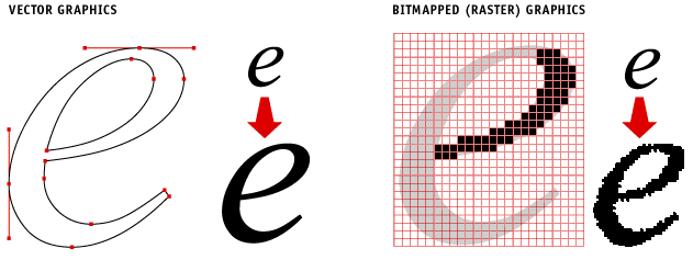
Vector graphics are comprised of paths, which are defined by a start and end point, along with other points, curves and angles along the way. A path can be a line, a square, a triangle, or a curved shape. These paths can be used to create simple drawings or complex diagrams. Paths are even used to define the characters of specific typefaces.
Raster (bitmapped) Graphics
A raster image is a collection of dots called pixels,commonly referred to as a bitmap. Each pixel is a tiny coloured square. When an image is scanned it is converted to a collection of pixels called a raster image. Most images you see on your computer screen are raster graphics. Pictures found on the Web and photos you import from your digital camera are raster graphics. The larger the image, the more disk space it will take up.

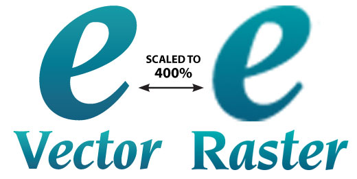
A vector object will have a "wireframe" underneath the colours in the object. In a vector object, colours are like clothes over the top of a skeleton. CorelDRAW and Illustrator create text and objects using vectors that can be easily manipulated. Because vector-based images are not made up of a specific number of dots, they can be scaled to a larger size and not lose any image quality. If you blow up a raster graphic, it will look blocky or pixelated. When you blow up a vector graphic, the edges of each object within the graphic stay smooth and clean.
What is DPI? DPI Stands for "Dots Per Inch." The more dots an image has per inch the better it will look when it is printed. Most images from the web hover around 72 DPI, which is not acceptable when printing. Raster images are dependent upon resolution so image enlargement is limited by the original size at which the file was created. If a file is produced at a size that is larger than its resolution will allow, the quality will decrease resultng in pixelation. Pixelation occurs when individual pixels are large enough to be easily discernible. Increasing the resolution will not solve this problem if there are not enough pixels to begin with.

As a general rule, if it came from a web page, the quality will most likely be too low for printing. Web graphics are made to load quickly, often times sacrificing the true quality of the image. The eye may not notice this when viewed with a browser, but becomes obvious when printed.
Colour Accuracy
- Beware of inconsistent black fills in your layouts. Black is a deceptive colour and even tough it may all look the same on a computer monitor, it can print quite differently. For best results set black at C=60%, M=50%, Y=40%, K=100% This will also avoid ink saturation and bleeding.
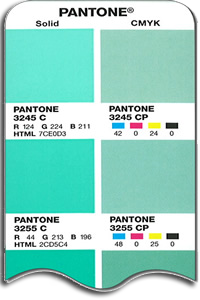
- We can colour match required Pantone colours. When choosing Pantone colours please always choose coated Pantone colours. Some colours are more likely to be achieved than others due to device limits, however all Pantone colours are matched to their best possible interpretation of our printers. If a Pantone colour is specified but coated or uncoated is not, our default is coated.
- Colours such as flourescen, neon and metallic colours cannot be replicated.
- Please note that colours look different on your monitor than in printed material. Please refer to the PMS swatch book call “PMS Bridge”. This book will show the spot colour and 4-colour build of that PMS side-by-side. It is a very helpful tool for understanding what will happen to a PMS colour when it is printed.

- Colour shifts between different prints and media types may occur.
- Vector art such as text and logos will print differently when rasterized in your file or exported as a tiff or bitmap, as it will be processed as an image rather than vector art.
- Colour accuracy will always be better if the document is set to CMYK mode rather than RGB. (Raster images can remain in RGB.)
- Pantone spot colours will print more accurately and more consistently if they are left as a spot colour in your file rather than converting it to CMYK.
- Some Pantone spot colours are treated as a CMYK colour in our Pantone spot colour matching system, so it is best to select a different Pantone spot colour that is lighter, but in the same tone.
- Do not use Pantone colours when designing transparencies, unexpected results may occur. Using process colours when designing with transparencies is the sure way of getting the desired effect in your final print.
FAQ
Is the quality of my image or file good enough for printing?
When working with an image or photo, the higher the quality of the image, the better it is going to look when printed. We recommend a resolution of at least 120dpi (dots per inch) for outdoor signage and 200 for indoor signage. Images with less resolution may look blurry or pixelated. We will review your files once we receive your order and will let you know via email if there are any issues.
If your image was sourced from a website on the Internet, it will likely not be of a high-enough resolution, since the Internet displays images at 72dpi.
What is a good height for letters be to ensure readability?
When choosing letter height, consider 1 inch of letter height equals a good viewing distance of 10 feet. However, the text is still visible up to 30 feet.
Text design also affects readability. Choose bold fonts with highly-contrasting colours to make the most impact.
How do I prepare files for printing borderless signs?
For best results is recomendable to include a 1/8” of bleed around the sign. You should also include a cut line in a separate layer (named cut). When ordering you should enter the dimentions of the signs including the bleed. For example, if you are designing a 16 x 24 sign, the overall dimensions of your file (with bleed) should be 16.25” x 24.25”.
How many colours can be used in my design?
You can use as many colours as you wish. Just keep in mind that too many colours can look cluttered and busy, reducing the overall effectiveness of your signage
What text colours do you recommend for optimal visibility?
It's always best to use as much colour contrast as possible. If your signs has a light background use dark text, or if the background is dark use light text, so that your message "pops" out from the background. It is best to limit the text colours to 2 or 3. Keep primary text in one colour and supplementary text in another. Using too many colours looks cluttered, busy and confusing.
What type of text do you recommend for optimal visibility?
Choose bold fonts with highly-contrasting colours to make the most impact. Use simple fonts such as Arial, Helvetica, Courier, Verdana and Times New Roman to name a few.
